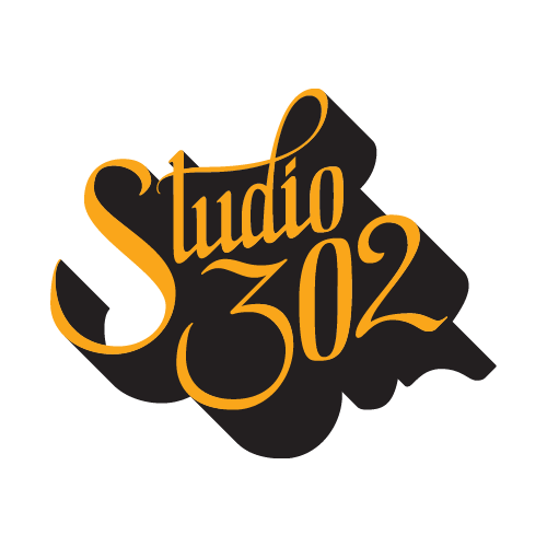
STUDIO 302
Every year the graduating class of the University of Houston Graphic Design program hosts an event that brings around 400 – 500 attendees. Many are creative professionals in and around Houston. Funds are raised primarily through participating in art markets selling silkscreen and letterpress prints, as well as other handcrafted products. Studio 302 was proposed as a brand for our class’s pop up shop.
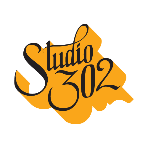
LOGO
The name Studio 302 derives from our studio’s room number in the University of Houston Fine Arts Building. The senior class changes every year, however the studio space remains as it is passed down to the next unique group of designers.
Primary
Reversed
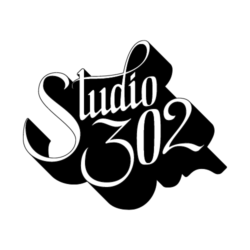
B&W / White Background
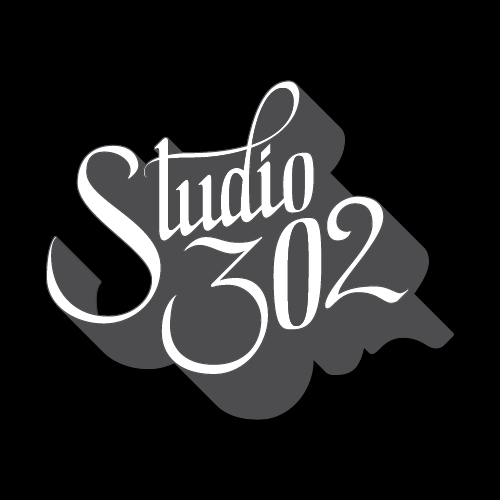
B&W / Black Background
COLOR
The primary colors for Studio 302 are black, orange peel, and white rock. Orange peel is used primarily for large type while black is most often used for the background. White rock serves as a supporting color. Additionally, the tone of all three colors can be adjusted in order to create depth and contrast within the design.
TYPOGRAPHY
The typefaces of the Studio 302 brand are Brandon Grotesque and Boucherie Block. The legibility of Brandon Grotesque makes it most suitable for body copy while the character of Boucherie Block is reserved for larger headers and display purposes.
BRANDON GROTESQUE
BOUCHERIE BLOCK
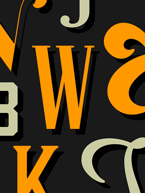
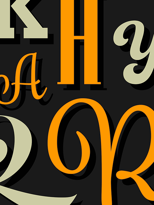
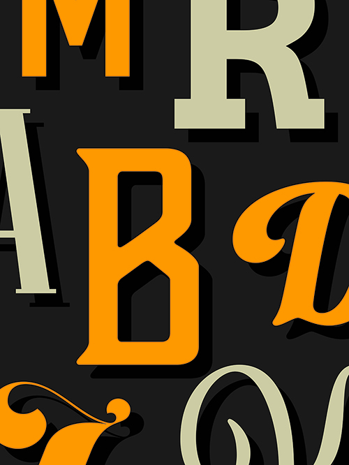
WOODBLOCK & MOVABLE TYPE
Typography is an essential aspect of visual communication and the introduction of woodblock and movable type in history was a pivotal moment for graphic design. Boucherie Block references the letterforms of early woodblock typographic posters.
CALLIGRAPHY & HAND LETTERING
Calligraphy and hand lettering are closely tied to graphic design. When either a calligrapher or a hand letterer writes or draws a word, they are visually communicating through the forms of the letters that they create. The logo of Studio 302 is influenced by the strokes found in calligraphy and the controlled precision found in hand lettering.
VISUAL LANGUAGE
The visual aesthetic of Studio 302 draws from the letterforms of various distinctive display typefaces. The letters are arranged to emphasize the different forms found in typography.